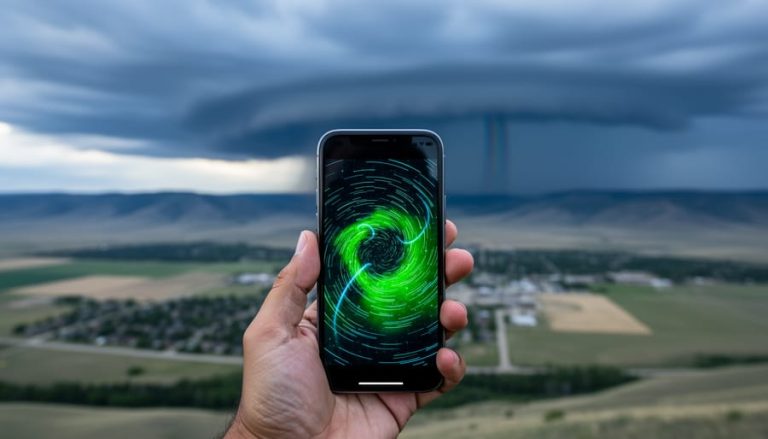
Air quality radar maps show real-time and forecasted levels of pollutants like wildfire smoke, fine particulate matter (PM2.5), ground-level ozone, and nitrogen dioxide across southern Alberta and the rest of Canada. Environment and Climate Change Canada generates these forecast maps twice daily, giving you a 72-hour window to see how smoke and air pollutants will move and evolve across North America. During wildfire season, these tools transform from nice-to-have resources into essential planning aids for anyone with respiratory conditions, outdoor work commitments, or kids playing sports.
The maps work by combining atmospheric modeling with current air quality monitor data to predict where smoke plumes will travel and when pollution levels will spike in your area. You’ll find multiple sources available: Environment Canada’s official forecasts, the BlueSky Canada smoke forecast for two-day wildfire smoke predictions, and the AirNow Interactive Map covering monitors across the U.S., Canada, and Mexico (though those readings are preliminary and unvalidated).
For southern Alberta residents, knowing how to read these maps matters most when wildfire smoke rolls in from British Columbia or when local agricultural burning affects air quality. The color-coded displays translate complex atmospheric data into actionable information: should you reschedule that morning run, keep the kids indoors, or plan that road trip for another day? The twice-daily updates mean you can check morning and evening forecasts to stay ahead of changing conditions, especially during the summer months when air quality can shift dramatically within hours.
How Air Quality Radar Maps Work
Air quality radar maps pull together data from multiple monitoring systems across North America to give you a picture of what’s happening in the air right now and what’s coming over the next few days. Environment and Climate Change Canada runs forecast models twice daily that track wildfire smoke dispersion, fine particulate matter levels, ground-level ozone, and nitrogen dioxide concentrations hour by hour for the next 72 hours. These aren’t basic readings from a single weather station, they’re sophisticated models that predict how smoke plumes will move based on wind patterns, atmospheric conditions, and active fire locations.
AirNow’s monitoring network adds another layer by collecting real-time readings from ground sensors across Canada, the United States, and Mexico. Those readings are preliminary and subject to change as they get validated, but they give you current conditions at specific locations. When you check an air quality map, you’re seeing data from hundreds of monitoring stations combined with computer models that fill in the gaps between sensors.
BlueSky Canada focuses specifically on wildfire smoke forecasts, providing what researchers call the current best estimate of when and where smoke events will hit over the next two days. This system is particularly useful during fire season because it tracks active blazes and predicts how their smoke will spread. The maps layer satellite imagery, ground measurements, and atmospheric modeling to show where smoke concentrations are building and which communities might see hazy skies or health warnings tomorrow.
None of these systems work alone. The radar maps you see online are usually combining Environment Canada’s twice-daily forecasts, AirNow’s monitoring network, and specialized smoke models into one visual tool that updates throughout the day.
What These Maps Show You
Air quality radar maps give you a lot more than just a simple “good” or “bad” rating. When you pull up one of these maps for southern Alberta, you’re looking at several layers of information that tell you exactly what’s in the air you’re breathing.
The main thing most of us check during wildfire season is the smoke dispersion pattern. These maps show where wildfire smoke currently sits and where it’s headed over the next 72 hours. You can actually watch the smoke plumes move across North America, which helps you plan whether tomorrow’s outdoor activities are still a good idea or if you should postpone that hike.
Beyond smoke tracking, the maps display fine particulate matter levels, that’s PM2.5, the tiny particles small enough to get deep into your lungs. You’ll see these concentrations measured in micrograms per cubic meter, updated hourly. Ground-level ozone is another key measurement, especially important on hot summer days when ozone builds up near the surface. The maps also track nitrogen dioxide concentrations, which come primarily from vehicle emissions and industrial activity.
What makes these tools genuinely useful is the forecast component. Environment and Climate Change Canada generates their model forecasts twice daily, giving you a 72-hour look ahead at how conditions will change. This means you’re not just seeing current conditions, you’re seeing predictions about when smoke might roll into Calgary or when it might clear out.
Keep in mind that readings from platforms like AirNow are preliminary and subject to change as monitoring stations validate their data. But even with that caveat, these maps give you enough accurate information to make informed decisions about your day.
Where to Access Air Quality Radar Maps for Southern Alberta
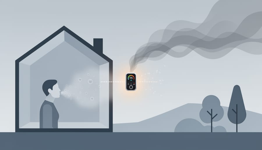
Finding reliable air quality radar maps for southern Alberta is simpler than you might think, though it’s smart to check more than one source since forecasts update throughout the day.
Environment and Climate Change Canada operates the official national air quality forecast system, generating model maps twice daily that show PM2.5, ozone, nitrogen dioxide, and wildfire smoke dispersion across the country for the next 72 hours. Their forecasts are specifically designed for Canadian conditions and weather patterns, making them your go-to resource for what’s happening overhead in Calgary, Lethbridge, and rural areas across the province.
For wildfire smoke specifically, BlueSky Canada provides smoke forecast maps that predict when and where smoke events may occur over the next two days. During active fire seasons, these forecasts become invaluable for planning outdoor activities, sports events, and even deciding whether to open windows overnight. The system tracks smoke movement across North America, so you’ll see both local fires and smoke drifting in from British Columbia or the United States.
The AirNow Interactive Map covers air quality monitors across Canada, the U.S., and Mexico on a single platform. It’s particularly useful when smoke is moving across borders or when you’re traveling and want to check conditions at your destination. The interface is straightforward: zoom to your area, check the color-coded readings, and see hourly concentration levels at monitoring stations.
Keep in mind that all these readings are preliminary and subject to change as new data comes in. Forecasts get updated twice daily, so checking in the morning and again in the evening gives you the most current picture. Bookmark two or three of these sources and you’ll always know what the air looks like before you head outside.
Reading the Maps: What the Colors and Numbers Mean
The numbers and colors on air quality radar maps aren’t just decorative, they tell you exactly what you’re breathing and whether it’s safe to head outside.
Most Canadian air quality maps use the Air Quality Health Index (AQHI) scale, which runs from 1 to 10+. Low-risk conditions show up in blues and greens, while moderate levels appear yellow to orange. When the map turns red or purple, that’s your signal that air quality has deteriorated significantly. These colors correspond directly to health risk categories, making it straightforward to read the map at a glance. Concentration measurements for PM2.5 appear in micrograms per cubic meter (μg/m³), with readings above 35 μg/m³ triggering health advisories.
| AQHI Level | Color | Health Risk | What to Do |
|---|---|---|---|
| 1-3 | Blue/Green | Low | Enjoy outdoor activities as usual |
| 4-6 | Yellow/Orange | Moderate | Sensitive groups should reduce intense outdoor activities |
| 7-10 | Red | High | Everyone should reduce or reschedule strenuous activities |
| 10+ | Purple | Very High | Avoid outdoor exertion; children and seniors stay indoors |
When wildfire smoke rolls into southern Alberta, you’ll often see dramatic color shifts across the map as PM2.5 levels spike. A reading that starts green in the morning can turn orange or red by afternoon as smoke disperses across the region. Following these real-time radar tips helps you plan your day, whether that’s moving tomorrow’s soccer practice indoors or timing your morning run before smoke arrives.
For everyday decisions, treat yellow as a heads-up for anyone with asthma or heart conditions. Red means everyone notices the air quality, and purple days call for genuine caution.
Why Southern Albertans Are Checking These Maps More Often
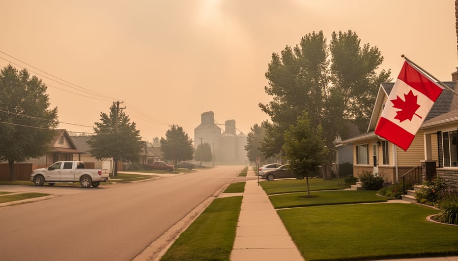
Southern Albertans have grown more watchful of air quality conditions as wildfire seasons intensify and smoke events reach our communities with increasing frequency. Calgary and surrounding areas now experience smoke-affected days that weren’t common a decade ago, prompting residents to check conditions before heading outdoors or planning activities with their families.
The shift is noticeable during summer months when wildfire smoke from British Columbia, northern Alberta, or even distant fires in the Northwest Territories drifts south and settles across the region. What used to be rare news has become a regular part of extreme weather updates that southern Albertans now track alongside temperature and precipitation forecasts.
Parents check air quality before letting kids play outside. Runners adjust their training schedules. Outdoor event organizers monitor forecasts to decide whether to proceed or postpone. People with respiratory conditions, asthma, or heart disease have learned that even moderate smoke levels can trigger symptoms, making advance planning essential rather than optional.
The conversation has moved beyond “Is it smoky?” to “How bad is it, and when will it clear?” Listeners call into Calgary Now discussing how smoke affects their daily routines, comparing readings between neighborhoods, and sharing strategies for managing outdoor activities during poor air quality days. These radar maps have become practical tools that Albertans now consider as routine as checking the weather forecast before making weekend plans.
Common Questions About Air Quality Radar Maps
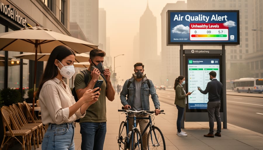
Here’s a reality check: southern Albertans have plenty of practical questions about these maps, and the answers matter when you’re deciding whether to let the kids play outside or reschedule that afternoon hike. Let’s tackle the most common ones.
How accurate are the wildfire smoke forecasts on these maps?
Environment and Climate Change Canada’s forecast maps represent the best available predictions, but they’re models, not guarantees. Weather patterns shift, fires behave unpredictably, and smoke movement can change hour by hour, so treat these as valuable guidance rather than absolute certainty.
How often should I check air quality radar maps during wildfire season?
Since the forecast models update twice daily, checking morning and evening gives you the clearest picture of what’s coming. If you’re planning outdoor activities or have respiratory sensitivities, a quick look before heading out makes sense.
What PM2.5 level is considered safe for outdoor activities?
Generally, PM2.5 readings below 50 micrograms per cubic meter are acceptable for most people, though sensitive groups should be cautious even at lower levels. Above 100, everyone should reduce prolonged outdoor exertion.
Why do different maps sometimes show different air quality readings?
You’re looking at different data sources and update schedules. AirNow readings are preliminary and unvalidated, BlueSky Canada focuses specifically on smoke forecasts for the next two days, and Environment Canada’s models cover the full 72-hour window with twice-daily updates, so timing and methodology create natural variations.
When air quality warnings are issued for your area, the advice is straightforward: limit outdoor time, keep windows closed if smoke is heavy, and postpone strenuous activities until conditions improve. People with asthma, heart conditions, or respiratory issues should be especially cautious. The maps help you see what’s coming, but common sense and how you actually feel outside matter just as much as the numbers on screen.
Air quality radar maps have become essential everyday tools for southern Albertans navigating wildfire season and planning outdoor activities. By checking Environment and Climate Change Canada’s twice-daily forecasts or the BlueSky Canada smoke predictions, you’re making informed decisions that protect your health and help you plan your day. These maps aren’t just about numbers on a screen, they’re about knowing when it’s safe to go for that morning run, whether to reschedule your kid’s soccer game, or if you should keep the windows closed.
Understanding how air quality works gives you more control over your environment. Bookmark the AirNow Interactive Map and the official Canadian forecasts so they’re ready when you need them. We’d love to hear your experiences, have these tools changed how you approach smoky days? Do you check them before heading outside? Call in and share your air quality monitoring stories with our presenters, or let us know what questions you still have about keeping your family safe when smoke rolls into southern Alberta.